Book Review "The Art of Croods"

Author: Noela Hueso
Hardcover: 176 pages
Publisher: Titan Books
Release Date: March 26, 2013

Our Score: 3.5 out of 5 stars

“The Croods” is the newest CG animated films from Dreamworks Animation.  They are the studio behind recent films like “How to Train Your Dragon” and “Rise of the Guardians”.  After “Guardians”, the studio really needs a hit.  To be honest, I was not interested at all in seeing “The Croods”…that is until I read this book.  I recently had the chance to check out “The Art of Oz The Great and Powerful” and I was hoping for something special there but was really let down.  This book here is what I expect when I want to read an “art of” book.

The book is split into three main sections. The first section, “Finding The Croods”, looks into our cast including Grug, Eep, Guy, and Belt. We get glimpses of early sketches, digital paint images and CG models.  I love getting to see different variations of the characters in order to see their evolution and in this case since they are pre-historic that work holds more of a meaning. The second part is “An Evolving World” looks at the creatures and landscapes that make up The Crood’s world.  We look into the various sets into the caves, jungles, tundras and gorges.  The last section looks into the “Anatomy of a Scene”.  This looks into the production from the story to the effects and how they are blended together into the final product.

“The Art of The Croods” clocks in with over 400 pieces of concept art, character sketches, storyboards and digital paintings. Like with all of Titan Books releases, this is yet another high quality book and has some very colorful and sharp images.  Along side the great art there are also interviews with the key animation talent. There is a foreword by Nicolas Cage, which I have to admit is one of the worse that I have ever read.  Sorry Nic Cage, I am usually a fan but this is foreword is about a paragraph long. This is author’s Noela Hueso first book, so with that in mind this is a great first go at it. Previously she had worked at the The Hollywood Reporter for 16 years, so she definitely has the necessary knowledge of the business.


Related Content

Book Review "The Art of Oz The Great and Powerful"

Author: Grant Curtis
Paperback: 256 pages
Publisher: Disney Editions
Release Date: March 5, 2013

Our Score: 2.5 out of 5 stars

When you watch “Oz: The Great and Powerful”, you literally drool at what a visual marvel this film is.  There is no denying why this film cost over $200 million dollars. So once watching it I knew that Disney would have to make an equally amazing “art of” book like they have so well done with their releases in the past. “The Art of Oz The Great and Powerful” though is a bit underwhelming. The first thing that I thought when I opened it is that is plays out more like a visual companion or “making of” book than it does an “art of” book. In terms of visual, it is quite impressive but in terms of art it falls a bit short overall.

This release is also a recent first for Disney to publish in paperback only.  The book though runs much cheaper at around $15 dollars but I still would prefer to pay a bit more and get a nice hardcover.  When I think of “Art of” book, I think of a high quality hardcover collectible. After a wonderful film like “Oz” was, I  feel like it really deserved a hardcover binding a little more more TLC, just sayin’. In terms of content though this book is in the right hands.  It is written by Grant Curtis, who is also the film’s executive producer and has worked with Raimi before on numerous other projects. He also authored “The Spider-Man Chronicles”, which was a very sharp book as well (despite how bad “Spider-Man 3” was).  I feel that he does a good job here with delivered interesting content and images but the book suffers from a general lack of love.

“The Art of Oz The Great and Powerful” focuses mostly on the production of the film and features some never-before-seen film stills, a little bit of concept art, all tied up with some nice interviews with the cast and crew. The artwork included was very environmental including the sets and locations.  Since the film is basically all CGI, I would have expected to be a very large plethora of art created by Disney’s talented artists in order to bring their visions to life.  I am sure there was but it is not represented here to the extent that I was hoping for. If you are looking for a look more into the filming process, then this might be the ticket to explore the wonderful land of Oz. I just felt like it was missing a bit of the magic that the film was filled with.

The Art of Joe Alves, Production Designer of “Jaws” and “Close Encounters,” Now Available to Fans

THIS GIVEAWAY HAS ENDED AND WINNERS HAVE BEEN NOTIFIED VIA EMAIL. PLEASE CHECK BACK EACH WEEK FOR NEW GIVEAWAYS!

With almost six decades in the film business, it would be hard for Joe Alves to pick his favorite project. Alves, an Oscar nominated and BAFTA award winning production designer, is responsible for the look of such classic films as “Jaws,” “Close Encounters of the Third Kind,” “Escape From New York” and many others. Recently Alves decided to offer to fans the opportunity to purchase autographed copies of some of his story boards from “Jaws” at his new site – www.joealvesmovieart.com

Alves is also offering an exclusive autographed compilation of some of his conceptions for “Close Encounters” as well as a composite of his visions of the ID from “Forbidden Planet,” one of the first Hollywood features Mr. Alves worked on.

With this year marking the 35th Anniversary of “Close Encounters” please take a moment to revisit my interview with Mr. Alves in which he discusses his amazing career.

Mr. Alves has graciously provided Media Mikes readers a chance to win an autographed “Jaws” illustration of their choice. All you have to do is let us know your favorite scene from “Jaws.” One random winner will be picked from all comments and that winner will be notified by email. Contest ends at Midnight EST on December 16.


Related Content

Film Review “The Art of Flight 3D”

Actors: Travis Rice, John Jackson, Mark Landvik, Scotty Lago, Jake Blauvelt
Directors: Curt Morgan
Rated: PG (Parental Guidance Suggested)
Studio: Red Bull Media House
Running Time: 80 minutes

Our Score: 4 out of 5 stars

“The Art of Flight 3D” not just another documentary film about snowboarding. It is much more.  The film was released prior back in September 2011 but was not in 3D.  Let me tell you that adding the third dimension to this film really makes the difference.  Like I said this is not just about snowboarding, the film is jam-packed with action, adventure and even drama. It follows the well-known snowboarder Travis Rice and his friends as it follows them over two years as they aim to experience the limit of snowboarding. The film is released from Red Bull film division…that’s right the energy drink.  This film is your average documentary on a bender of Red Bull.  I would highly recommend experiencing this film, especially in 3D.

Official Synopsis: Brace yourself for a new breed of action sports film as Red Bull Media House presents the re-release of Red Bull Media House’s acclaimed film now in 3D titled “The Art of FLIGHT 3D,” a Curt Morgan film. “The Art of FLIGHT 3D” combines meaningful storytelling and character development with sport progressing action, all captured on state-of-the-art filmmaking equipment, much of which has been custom designed just for this project. Equal parts stunning action and harrowing adventure mix with the inevitable drama encountered along the way, presenting viewers with an exclusive opportunity to experience these endeavors virtually firsthand. With unprecedented access, the audience will share in the experience as snowboarder Travis Rice, along with a cast of the best riders in the world, complete a two-year quest to redefine what’s possible on a snowboard.

First of all the cinematography in the film is extremely impressive, thanks to filming with the RED camera system. It really scales up the film and makes it feel much bigger. We get to experience the mountains in locations like Chilean Patagonia’s Darwin Range, Alaska’s Tordrillo Range, Wyoming’s Snake River Range, Aspen, Colorado, the Andes, as well as British Columbia’s Kootenay Mountains. The 3D really added a lot of depth to these wonderful landscapes. I am sure it looked amazing on Blu-ray without but I really enjoyed the depth added to the locations. When it comes to snowboarding films, you got to make sure to have a killer soundtrack and “The Art of Flight” does not disappoint. It features the music of The Naked and Famous, M83, Deadmau5, Sigur Rós and more.

“The Art of FLIGHT 3D” will be released exclusively in AMC Theatres on December 7th in markets including New York, Boston, Seattle, San Francisco, Spokane, Denver, Salt Lake City, Charlotte and Minneapolis.  The film will also be available via TUGG throughout December 2012 and Winter 2013.  TUGG is a web-platform that enables moviegoers to choose the films that play at their local theaters. Then hopefully Red Bull is planning a 3D Blu-ray release since I would love to own this film for repeat viewings.

Book Review “The Art of Wreck-It Ralph”

Author: Maggie Malone, Jennifer Lee
Hardcover: 160 pages
Publisher: Chronicle Books
Release Date: November 1, 2012

Our Score: 5 out of 5 stars

When I saw the film “Wreck-It Ralph”, I thought that my prayers were answered as a video gamer that grew up in the 80’s.  This book shows just how much work went into this film and really allows you to appreciate it much more.  I had seen this film prior to reading this book and it literally made me want to run out again to see it.  If anyone reads this in reserve order you will surely get the immediate urge to see it. It is literally a perfect companion to this fantastic film.  The film is so extremely colorful and creative and unique and this book compliments all those aspects very well. Perfect idea for a Holiday gift!

The collaboration between authors Jennifer Lee and Maggie Malone really show that they love this film themselves and are looking to share it.  Jennifer Lee was a writer on “Wreck-It Ralph” and Maggie Malone is the director of development at Walt Disney Animation Studios, where she has worked on films including “Tangled”, “Tinker Bell”, and “The Princess and the Frog”. They succeeded in developing and delivered a very sharp book that makes you unable to put down.  It is very in-depth and goes into great detail on each of the video-game worlds created for this film.  There is specific focus on the design process and character development, which I enjoyed the most. It was cool to see the evolution of Ralph and how he came about. I also enjoyed the different interviews with the people behind this film. The artwork in the book is beautifully presented and very colorful.  Great job, Chronicle Books – yet again!

There is a preface included by Pixar’s John Lasseter, which nicely sets the mood for the book.  Rich Moore, the director of “Wreck-It Ralph”, gives a supporting foreword. Since this film takes aims at video games from the classic 8-bit arcade games to the video games of today’s high-def digital age. Both periods of gaming are perfectly respected and honored throughout this book. If you are looking for something to complement this great film or just something for your sweet tooth, then be sure to check out the “Sugar Rush” section. It made me crave some sweets ASAP, especially Devil Dogs.  Oh I miss Hostess already! If there is anything wrong with this book is that it ended, I would have love to kept reading for much longer.

Book Review “Awakening: The Art of Halo 4”

Author: Paul Davies
Hardcover: 192 pages
Publisher: Titan Books
Release Date: November 6, 2012

Our Score: 5 out of 5 stars

When it comes to video games, “Halo” is definitely the master chief of them all.  “Halo” has become such an iconic franchise over a short period of time.  “Halo 4” is the latest blockbuster installment, which is set to change history and re-define gaming. The story is set in the aftermath of “Halo 3”, it marks the beginning of a new trilogy as the Master Chief confronts an ancient evil that threatens the fate of the entire universe. In this book we get a glimpse into the beginning of this new trilogy within a stunning array of concept art, character sketches and much, much more. If you are a “Halo” fan, this is the holy grail of kick-ass books that you need to own for sure.

From the minute I opened this book, I was flooded with colors and amazing images.  It is one of those books that you literally cannot put down once opened.  Every page – every chapter is better than the next.  “Awakening: The Art of Halo 4” will satisfy all give gamers, whether they are hardcore or novice.  This book contains an in-depth look at the behind-the-scenes of how the stunning worlds of “Halo 4” were created. Fans of the series don’t fret since this book is also packed with some great commentary from the art director and game designers, so there is plenty of insider goodies.  We mentioned concept art and character sketches above, that is one the tip of the iceberg.  There is very detailed environments layouts, as well as an additional section on the forthcoming multiplayer game.

Author Paul Davies is definitely the right man for this job.  He is a crazy Halo fanatic (just like us) and has worked in gaming journalism for twenty years, where he has written and edited magazines and websites including Official Nintendo and Computer & Video Games. He wrote this book as a fan and therefore fans are going to really did it.  I read a lot of “art of” books and this one literally jumps off the pages.  Titan Books has deliver probably one of their best to date.  The quality of this book is just very high and it is aimed to satisfy the hardest gamers out there.  And if you are not the biggest “Halo” fan and just looking to see what all the fuzz is about this book will make you run to the store, trip the person in front of you and buy this game ASAP!

The Dude Designs’ Thomas Hodge talks creating art for the horror genre

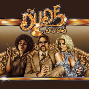
Thomas Hodge is the man behind The Dude Designs (thedudedesigns.blogspot.com). He is a
freelance film poster art director, designer and illustrator for such films as “Hobo With a Shotgun”, “The Innkeepers”, “Fathers Day!”, Arrow Video Covers: “Savage Streets”, “Jaguar Lives” and many others. Media Mikes had a chance to chat with Thomas about his work and his love for the horror genre.

Mike Gencarelli: Tell us about your got started with The Dude Designs?
Thomas Hodge: It was creative frustration and a passion for film. I’ve been in the design industry for over twelve years now, going through all types of design from corporate business to in-store promo for toys & DVD’s, general design agencies and have spent quite a few years in and out the games industry, creating key art for packaging etc. Creatively I felt I was always held back from producing something which would standout. so I rediscovered my love of old video cover art and that sent the old cogs grinding and i started experimenting more with styles and design to tap into that classic vain, in a market i felt was running dry creatively.  I suppose the initial inspiration was for an intoxicated night at the midnight movies screening of the grindhouse film. I was over there with a bunch of mates and they had silly draw a grindhouse poster so I entered my drunken scrawl for a poster of DUDE! Which I then later worked up into one of my early video cover experiments:

MG: How did you get involved doing film posters and DVD/Blu-ray covers?
TH: Like I said I started experimenting creating flyers for midnight movies night. It’s easier to start the wheels in motion design wise (I find) if you have a purpose, so doing the flyers on the side gave me that initial push (i was still working full time creatively) but it made me experiment with my passion of film as the medium, if you will. Creating the blog then gave me a platform to get this work out there for people to see. So from there I then was starting an art project creating old video nasty covers really getting wrapped up in all the little design niches that I loved, I was still working more with photographic imagery so to really capture that inspiration essence which excited me about this type of art I needed to push it further, and I worked on a self project titled Cannon (a mock 70 crime action drama based on my love of “Death Wish” and 70s Italian crime cinema) then I tackled a competition for Empire Film Mag in the UK and the response was great, with that style and my other work at Sony I picked up the arrow covers. Still wanting to push it further I saw the release of “Hobo “loved it and contacted the guys about creating a poster, they said sure love to see what you can do, i worked my nuts off on that. they loved it so much they brought it and used it… the rest as they say is history, but I’m still trying to push my style and work further with each project, I’m aiming for world domination of bust!

MG: Your work is a breath of fresh air from all the lame (giant heads) Hollywood posters, tell us about your influence?
TH: EVERYTHING from my childhood to adolescence, video rental shop shelves. Artist wise Graham Humphrey’s work form films like “Evil Dead”, “Nightmare on Elm Street”, “The Return of The Lliving Dead”, “Spookies”, “The Stuff”… man the list goes on. Enzo Sciotti, who is an amazing Italian poster artist from the 70’s and 80’s. Frant Frazetta for his use of form and figures is just incredible!  Even the more minimal work of Stephen Frankfurt has influenced me. All the greats which seem to have been forgotten about and over looked, good design has been excluded from commercial (I’m not talking about ‘limited edition’ screen prints) film posters for far too long now. The responsibility of that doesn’t come down to the designers either it’s the distributors who feel dumb is best to sell. My work has been swapped out for some appalling designs on DVD releases; did you SEE what they did to the Innkeepers in the UK? I’m always searching out new inspiration trying to push the envelope.

MG: How much freedom do you have when working on a project?
TH: Again it depends on the client, I usually try to get a lot though, why higher me else? If you’re going to pay me I will promise to deliver the best god damn poster design I can to appropriately promote your film to an audience. A lot of the time they will request a montage style poster, so that will be the framework but I like to experiment and try to sell other styles in to. At the end of the day I’m trying to get people trusting in what I do creatively and I sell myself more as a creative director of these projects. Working with directors directly gives the most freedom I find, they trust you and it usually forms the best relationships. I don’t do design by committee been there done that.

MG: What do you enjoy most about working in the horror genre?
TH: The fantasy element, it gives you that fun visual hook to play with. You can let your imagination run wild; I wish people would make more rubber monster films again. I feel I make as many twisted action flick as horror though.

MG: What is your favorite 80’s horror films? Current horror film?
TH: Oh man, how longs a piece of string? Er…. I honestly can’t say. I love them all for their 80’s cheesy. More modern is easier as there’s a lot less on the list (excluding all the ones i worked on as I don’t want to be seen showing favoritism) “Wendigo”, “Last Winter”, “I Can See You”, “Session 9”, “Pontypool”, “28 Days later”, “Altered”, “The Objective”, “Let The Right One In (Swedish)” and “Insidious” (that’s quite a mainstream one for me) stood out for me.

MG: How do you approach a project like the design for “They Live” Blu-ray?
TH: Well I look at what the films message is, visually how its approach and style, setting are. Then work on a visual which reflects those messages to the viewer. it’s an 80s action extravaganza combined with social commentary, staring one of the greatest wrestlers ever. So that’s what I drew! I was so enamored in the film in my head I was trying to produce a piece which had almost religious iconography undertones and Piper with Keith where latter day saints standing against adversity! Crazy shit hey, at first you may see big guns but if you look deeper there are messages. It doesn’t need to be like a minimal to be clever!

MG: What other projects do you have planned upcoming?
TH: We two corking (actually four) posters yet to get released for “Almost Human”, “Wake Before I Die” (bit of a change of gear on that one so see how people react, that’s always fun!). Then I got another poster for “Would You Rather” (which has a classic flavor) and a big fun monster one for “Hypothermia”, if they release it.

Book Review “The Art of Rise of the Guardians”

Author: Ramin Zahed
Hardcover: 158 pages
Publisher: Insight Editions
Release Date: October 22, 2012

Our Score: 3.5 out of 5 stars

If you are aware of “The Guardians of Childhood” series, which “Rise of the Guardians” is based off of, then you will appreciate the artwork from the series. The world that was created for this movie are provided in very high-detail through this book.  The children’s series is written by William Joyce, who’s also the film’s executive producer and gives a very nice foreword on the book.

“The Art of Rise of the Guardians” includes wonderful concept art for the DreamWorks animated film. The basis of the book is focused on the six main characters: North, Bunny, Tooth, Sandy, Jack Frost and Pitch. There is character profiles, as well as 3D and classic animation for each. Like I mentioned about the detail, besides just the character profiles, there is landscapes and sketches of the environments that were developed.  In the book, you get to see the work of all these fantastic artists and craftspeople who have collaborated in order to create DreamWorks Animation’s most ambitious films to date.

In the film “Rise of the Guardians”, North (Alec Baldwin), Bunnymund (Hugh Jackman), Tooth (Isla Fisher), and Sandman try to recruit the mysterious Jack Frost (Chris Pine) to help them stop Pitch (Jude Law) from putting an end to childhood belief and sending the world into eternal darkness.

Ramin Zahed is the editor in chief of Animation Magazine.  The man knows animation and gives this film art book the right treatment.  Alec Baldwin who voices North, gives a wonderful foreword.  The book itself has this very simplistic feeling.  Some of the pages are very simple, while some are jam-packed and extremely colorful.  I feel that it is really a wonderful balance of the two. The pastel of colors used in the book and throughout the film really pop-out here in the art-of book.  I am looking forward to this film very much and now more so since reading this book.

Book Review “Alien – The Illustrated Story (Original Art Edition)

Author: Archie Goodwin
Illustrator: Walt Simonson
Hardcover: 96 pages
Publisher: Titan Books
Release Date: October 30, 2012

Our Score: 5 out of 5 stars

Product Dimensions: 13 x 0.7 x 16.9 inches

When I first heard that “Alien – The Illustrated Story” was being released by Titan Books, I was sure excited because I am both a fan of Ridley Scott’s film “Alien” and also comic book artist Walt Simonson. But I got much more than I expected (in a good way). This good in the words of Buddy the Elf is “GINORMOUS”. But that is the charm of it I think, it clocks in at 13.8″ x 1 x 19.9″. If you can’t imagine it…just take my word its oversized. Though there is a reason for it, since it is scanned directly from Walt’s original art and reproduced at the same size. Since the pages are in fact scanned from the originals they even include all the corrections, paste-ups and even coffee stains. I was blown away that they would release this and very impressed.

But wait there is more. The story itself is only 64 pages. Also included is Archie Goodwin’s original script for the story, as well as Walt’s two page try-out for Fox (which actually featuring a very different alien). There is a great interview with Walt and letterer John Workman and closing with an afterword by Walt. If you don’t want the GIANT hardcover edition, then you can opt out for the totally not as cool softcover “Facsimile Cover Regular Edition”, which is also in color. I highly recommend this “Original Art Edition” it is an amazing companion piece to this movie book.

The book was written by the late Archie Goodwin, the comic book writer, known best for his Warren and Marvel Comics work. He was also the chief writer and editor of landmark horror anthology titles Creepy and Eerie. On a graphic novel, the illustrator is really the star of the show. Walt Simonson is the man behind this one and he has written, penciled or inked Batman, Fantastic Four, The Hulk and Superman just to name but a few!

Premise: Vacant. Two space helmets resting on chairs. Electronic hum. Lights on the helmets begin to signal one another. Moments of silence. A yellow light goes on. Electronic hum. A green light goes on in front of one helmet. Electronic pulsing sounds. A red light goes on in front of the other helmet. An electronic conversation ensues. Reaches a crescendo. Then silence. And when the silence is broken… the crew of the Nostromo must grapple with a terrifying life force they cannot leash, nor even comprehend – the Alien!

This book has been out of print for over thirty years, so this brand new edition timed perfectly with “Prometheus”, is a welcomed treat. It has been very carefully restored from original artwork in Walt Simonson’s studio and is presented here for the very first time in this definitive artist’s edition of the greatest sci-fi horror ever produced. So if you are a fan of “Alien”, sci-fi or event art…then this is a the book for you. Just make sure you have a very large coffee table – very large – because you will need it.


Related Content

Book Review “The Metropolitan Museum of Art: A 3D Expanding Pocket Guide”

Author: Sarah McMenemy
Reading level: Ages 5 and up
Hardcover: 30 pages
Publisher: Candlewick
Release Date: August 14, 2012

Our Score: 3.5 out of 5 stars

This is my third book in this Keepsake Cityscapes series that I have had the pleasure to review. I really enjoyed “New York: A 3D Keepsake Cityscape” and “Washington D.C.: A 3D Keepsake Cityscape”. These books are very simple and yet very effective. They pack a lot of great information into a small package. This latest volume takes us on a tour New York’s Metropolitan Museum of Art.

“Welcome to the Met! Boasting more than two million works, it’s one of the world’s largest art museums. Learn about twelve top attractions, including the lovely Charles Engelhard Court, the formidable Arms and Armor Court, and the Modern Art Gallery showcasing works from Monet to the artists of today.”

The author Sarah McMenemy is the creator of this series and also including “London: A 3D Keepsake Cityscape” and “Paris: A 3D Keepsake Cityscape”. These foldout books with cutout paper are a great tool for kids to learn with and not having to leave the comfort of their homes. I am sure that it will also spark some inspiration with some kids to plan their future trips in their life. Look forward to reviewing future editions of this series.


Related Content

Book Review “The Art of Assassin’s Creed III”

Author: Andy McVittie
Hardcover: 144 pages
Publisher: Titan Books
Release Date: October 30, 2012

Our Score: 4 out of 5 stars

The “Assassin’s Creed” video game series is one of the most unique available today.  The first game launched in 2007 and since then the first four Assassin’s Creed games have sold more than 38 million units worldwide.  The franchise quickly established itself one of the best-selling series ever. My only question is WHERE IS THE MOVIE ADAPTION? There has been a lot of hype and anticipation behind the arrival of “Assassin’s Creed III”.  This book is an exclusive art book to showcase the wonderful art that has gone into making this new installment.

If you are fan of this franchise, I cannot stress how this book is a must have.  One of the factors that makes “Assassin’s Creed” so successful is that it has some of the most original and deep art matched with storytelling in the business. The book is authored by Andy McVittie, who has been working in the video games industry for more than twenty years. He is known best for his work in well-known magazines like  Nintendo Official Magazine and PlayStation Plus.  So he knows his video games and his passion is shown throughout this book.

What makes “Assassin’s Creed III” unique in the franchise is the introduction of a  new assassin and takes place in a revolutionary world. So this book is a perfect introduction to this character and the new world that the story takes place in.  If you are hardcore fans, you are going to be drooling over the new interactive cityscapes and frozen winter landscapes showcased in this book.  Also revealed are the new threats from the natural world including weather systems that affect actual affect gameplay.  Also fans will be happy to know that all these has been perfectly and (most importantly) historically recreated by the Ubisoft studio. So get ready to completely immerse yourself in this book, since “Assassin’s Creed III” to certain to be the biggest and best yet in the series.


Book Review “Dinosaur Art: The World’s Greatest Paleoart”

Edited by: Steve White
Foreword: Philip J. Currie
Introduction: Scott D. Sampson
Hardcover: 188 pages
Publisher: Titan Books
Release Date: September 4, 2012

Our Score: 4 out of 5 stars

Growing up as a kid, dinosaurs have always thrilled me whether it is in pictures or movies. But there is something about looking through an paleoartist illustration of these creatures that is so breathtaking. This book is an awesome collection of work from various different paleoartist who specialize in blending science and art in order to reconstruct these ancient animals and their lost world. Edited together very well by Steve White, this book included illustrations and artwork from top of the top contemportary paleoartists. This is a must for all fans of dinosaurs.

I will give a break down of the artists in this book.  Mauricio Anton, Raúl Martin and Robert Nicholls are all known best for through work which has been exhibited all around the world  and in museums worldwide. John Conway has worked on various projects for the Discovery Channel and the American Museum of Natural History.  Julius Csotonyi has also worked with numerous museum exhibits, as well as National Geographic. Douglas Henderson was actually in the film “Jurassic Park” as ‘Dinosaur Specialist’.  Gregory S. Paul has also worked with the  filmmakers of Jurassic Park and several other TV series. He also has renamed several dinosaurs from working in the field. Todd Marshall is best known for collaborating with paleontologist, Paul Serono.  Luis Rey is the illustrator of “Dinosaurs: The Most Complete, Up-to-Date Encyclopedia for Dinosaur Lovers of All Ages.” Lastly John Sibbick has been illustrating dinosaurs for 30 years.

“Dinosaur Art: The World’s Greatest Paleoart” is filled with some truly amazing artwork, some of which have never before seen.  The illustrations range from digital to black and white drawings.  We get a really broad range of different artwork, especially since it is from so many different artists.  The art is also not limited to limited to just dinosaurs, there are also many other prehistoric mammals included. Note: be sure to take a peek behind the dust jacket for an amazing image of two silver dinosaur skeletons. Overall this book is highly recommended and another gem from Titan Books.

Titan Books


Related Content

Book Review “The Art and Making of Hotel Transylvania”

Author: Tracey Miller-Zarneke
Hardcover: 160 pages
Publisher: Titan Books
Release Date: September 25, 2012

Our Score: 4 out of 5 stars

I am huge fan of the classic Universal monsters and films like Rankin/Bass’ “Mad Monster Party”. “Hotel Transylvania” feels like a 2012 new take on classic horror monsters like Dracula, Frankenstein, the Mummy, Werewolf, and the Invisible Man. The film is directed by Genndy Tartakovsky (who also delivers a great foreword), creator of “Samurai Jack” and executive producer and director of “Star Wars: Clone Wars” animated series, so you know you are getting quality. “The Art and Making of Hotel Transylvania” is a very fun and very informative look into the film and its production. Titan Books scores again for sure. When I honestly see that they are doing an Art/Making of book, I get psyched because they never you let down. This book also got me 100% more excited to see this film now. Fans of classics monsters, definitely check this out!

The film features the classic monsters but in more modern settings like Dracula owns a monsters-only hotel. I think that is a fun twist and should please both kids and parents alike. This book not only covers the beautiful art of this animated CG film but also dives deep into the production. There are over 400 pieces of concept art, character sketches, storyboards and digital art. It is nice to also include the digital aspect of the film since it really gives an insight into how much work went into this film. I am just a huge fan of concept art, I don’t know what it is but I love seeing the artists different conceptual designs. Besides all art there is also numerous interviews with filmmakers and crew chatting about the creating this film.

This book is authored by Tracey Miller-Zarneke, who has credited roles on the feature films “Meet the Robinsons”, “Chicken Little” and “The Emperor’s New Groove”. So this lady actually knows animation very well. If you still need more proof, Tracey has also written a bunch of other amazing “art of” books including “The Art and Making of Cloudy With a Chance of Meatballs”, “The Art of Kung Fu Panda 2” and “The Art of How to Train Your Dragon”. The book is very well presented and just looks amazing. The colors are very sharp and really pop off the pages. If their goal for this book was to really deliver us the world behind the film, “Hotel Transylvania”, (which I am sure it was) then they did their job very well. Highly recommended!

Book Review “Poster Art of the Disney Parks”

Authors: Daniel Handke, Vanessa Hunt
Hardcover: 144 pages
Publisher: Disney Editions
Release Date: September 11, 2012

Our Score: 4 out of 5 stars

There is something just magically about Disney Parks.  It may not be something that everyone can pick up on who visits the park but it is there if you take the time to open your eyes.  Walking through Disney is such a magical experience, the sights, the music, the smells, the characters…the artwork.  The poster art around Disney is so iconic and memorable, as well as timeless. This book is a tribute to all of those amazing posters that grace the park for the rides and shows.  These wonderful works of art were created for guests by the Imagineers.  The Disney Imagineers are legends and masters of their craft.  There are able to tell a story of each attraction through their artwork and whisk away its audience to a magical place.

Disney’s attraction posters have always been critical part of attraction since Disneyland started displaying them in the late 1950’s.  Not only are they eye-catching wonders but they also give you can insight into the world of Disney and what to expect from the park.  One of the first attraction posters (and maybe the best) was for the ride Jungle Cruise. And they are still such a important factor in today’s times with the 2012 opening of Cars Land in Disney’s California Adventure. Those are just two of the posters that are reproduced and represented within this book. Also showcased is the wonderful art from “Tiki Room” and “Splash Mountain”,  along with dozens of other posters from every decade since the 50’s.

I also really enjoyed watching the art styles and design techniques change over the years and yet still remain the same in a way. It just proves how timeless Disney is and how the art for these rides and shows are relevant today.  In the book, it is doesn’t just focus on Disneyland and Disney World though there is showcasing from all different continents like Tokyo Disneyland, Disneyland Paris, and Hong Kong Disneyland.  They show have each park has their own unique signature look yet still hold true the Disney charm and spirit lying within them all.  My only real complaint about the book is that there is a bit of white space surrounding the artwork.  Nonetheless Disney Editions scored again with another beautiful coffee table book.  Upon receiving this book, my wife decided to spoof “Jaws” and tell me the following “We’re gonna need a bigger coffee table.”

Book Review “The Art and Making of The Dark Knight Trilogy”

Author: Jody Duncan Jesser
Hardcover: 304 pages
Publisher: Abrams
Release Date: July 20, 2012

Our Score: 3.5 out of 5 stars

First things first, let me clear this up right off the bat (get the pun?). This book is labeled as a “Art of” book but really this leans a lot more in the “making of” aspect. It you look at it from that prospective then it works well. I would have love to see a full on “art of” book though. Director Christopher Nolan really did an amazing job of reviving the Batman franchise. Casting Christian Bale as the Caped Crusader was such an amazing choice, as he was perfect for the role. “Batman Begins” was a really sharp reboot of the franchise exploring the origins of billionaire Bruce Wayne to Batman. “The Dark Knight”, which is my personal favorite in the series, took the franchise to such a high level putting Batman against the Joker (plays by the late Heath Ledger). The final film of Nolan’s trilogy, “The Dark Knight Rises”, provided a very exciting and satisfying closing to this trilogy. Bane is one of my new favorite villains, played by Tom Hardy, who was out of this world. “The Art and Making of The Dark Knight Trilogy” focuses on the complete behind-the-scenes stories from each of these three epic films. Die-hard fans of The Dark Knight should know that this is a no-brainer.

There are eleven chapters included in the book.  The first focuses on “Screenplay”, the birth of the scripts and inspiration from the comics.  The second takes a look at the “Production Design”, which is key to this series.   It focuses on the sets, shooting locations and includes some nice concept art. Next up is “Cast”, which focuses on picking Christian Bale to play Bruce Wayne but look at all primary roles. Chapter four is titled, “Costumes & Makeup” and goes into details on Bat’s suit, the Joker’s makeup etc. The next three chapters are titled “The Shoot” and covers each of the film in the trilogy during production.  Special effects coordinator Chris Corbould takes the lead in the next chapter “Special Effects & Stunts “, covering the fight sequences and stunts from the three films. Next up, Lee Smith covers “Editing, Music, and Sound”, also includes quotes from composers Hans Zimmer and James Newton Howard. “Visual Effects” is a great chapter, especially since it was a critical part of the franchise.  This series used multiple different types of visual effects ranging from models and miniatures to CGI.  The last chapter focuses on the franchises “Marketing” and various aspects of promotion for these films. I mean can you ask for more? I think not.

Author Jody Duncan Jesser, editor of Cinefex magazine since 1992, really delivered a very intensive and thorough look into this franchise. She is no stranger to “making of” angle for Hollywood films having worked books for “Terminator 2”, “Jurassic Park”, and “Avatar”. She includes many in-depth interviews with Christopher Nolan and the films’ key cast and crew, including cowriters David S. Goyer and Jonathan Nolan, cinematographer Wally Pfister. There is much detail into the creative process behind the epic “Dark Knight” Trilogy, which is backed with (some) art and beautiful never-before-seen photography. The book runs over 300 pages and includes hundreds of photos, so it guaranteed to please any fan of the series. The book also includes a foreword by Christopher Nolan and an intro by Michael Caine. If that all isn’t enough there is also Nolan’s tribute originally published in Newsweek in 2008 about Heath Ledger, titled “Charisma as Natural as Gravity”. As good as this book does in covering each film, I also really enjoyed and highly recommend this book: “The Dark Knight Manual: Tools, Weapons, Vehicles and Documents from the Batcave”.


Related Content