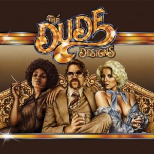
 Thomas Hodge is the man behind The Dude Designs (thedudedesigns.blogspot.com). He is a
freelance film poster art director, designer and illustrator for such films as “Hobo With a Shotgun”, “The Innkeepers”, “Fathers Day!”, Arrow Video Covers: “Savage Streets”, “Jaguar Lives” and many others. Media Mikes had a chance to chat with Thomas about his work and his love for the horror genre.
Mike Gencarelli: Tell us about your got started with The Dude Designs?
Thomas Hodge: It was creative frustration and a passion for film. I’ve been in the design industry for over twelve years now, going through all types of design from corporate business to in-store promo for toys & DVD’s, general design agencies and have spent quite a few years in and out the games industry, creating key art for packaging etc. Creatively I felt I was always held back from producing something which would standout. so I rediscovered my love of old video cover art and that sent the old cogs grinding and i started experimenting more with styles and design to tap into that classic vain, in a market i felt was running dry creatively. I suppose the initial inspiration was for an intoxicated night at the midnight movies screening of the grindhouse film. I was over there with a bunch of mates and they had silly draw a grindhouse poster so I entered my drunken scrawl for a poster of DUDE! Which I then later worked up into one of my early video cover experiments:
MG: How did you get involved doing film posters and DVD/Blu-ray covers?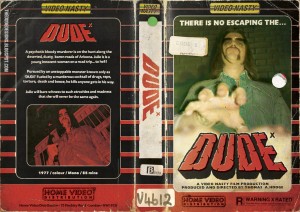
TH: Like I said I started experimenting creating flyers for midnight movies night. It’s easier to start the wheels in motion design wise (I find) if you have a purpose, so doing the flyers on the side gave me that initial push (i was still working full time creatively) but it made me experiment with my passion of film as the medium, if you will. Creating the blog then gave me a platform to get this work out there for people to see. So from there I then was starting an art project creating old video nasty covers really getting wrapped up in all the little design niches that I loved, I was still working more with photographic imagery so to really capture that inspiration essence which excited me about this type of art I needed to push it further, and I worked on a self project titled Cannon (a mock 70 crime action drama based on my love of “Death Wish” and 70s Italian crime cinema) then I tackled a competition for Empire Film Mag in the UK and the response was great, with that style and my other work at Sony I picked up the arrow covers. Still wanting to push it further I saw the release of “Hobo “loved it and contacted the guys about creating a poster, they said sure love to see what you can do, i worked my nuts off on that. they loved it so much they brought it and used it… the rest as they say is history, but I’m still trying to push my style and work further with each project, I’m aiming for world domination of bust!
MG: Your work is a breath of fresh air from all the lame (giant heads) Hollywood posters, tell us about your influence?
TH: EVERYTHING from my childhood to adolescence, video rental shop shelves. Artist wise Graham Humphrey’s work form films like “Evil Dead”, “Nightmare on Elm Street”, “The Return of The L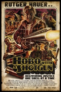 living Dead”, “Spookies”, “The Stuff”… man the list goes on. Enzo Sciotti, who is an amazing Italian poster artist from the 70’s and 80’s. Frant Frazetta for his use of form and figures is just incredible! Even the more minimal work of Stephen Frankfurt has influenced me. All the greats which seem to have been forgotten about and over looked, good design has been excluded from commercial (I’m not talking about ‘limited edition’ screen prints) film posters for far too long now. The responsibility of that doesn’t come down to the designers either it’s the distributors who feel dumb is best to sell. My work has been swapped out for some appalling designs on DVD releases; did you SEE what they did to the Innkeepers in the UK? I’m always searching out new inspiration trying to push the envelope.
MG: How much freedom do you have when working on a project?
TH: Again it depends on the client, I usually try to get a lot though, why higher me else? If you’re going to pay me I will promise to deliver the best god damn poster design I can to appropriately promote your film to an audience. A lot of the time they will request a montage style poster, so that will be the framework but I like to experiment and try to sell other styles in to. At the end of the day I’m trying to get people trusting in what I do creatively and I sell myself more as a creative director of these projects. Working with directors directly gives the most freedom I find, they trust you and it usually forms the best relationships. I don’t do design by committee been there done that.
MG: What do you enjoy most about working in the horror genre?
TH: The fantasy element, it gives you that fun visual hook to play with. You can let your imagination run wild; I wish people would make more rubber monster films again. I feel I make as many twisted action flick as horror though.
MG: What is your favorite 80’s horror films? Current horror film?
TH: Oh man, how longs a piece of string? Er…. I honestly can’t say. I love them all for their 80’s 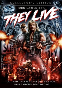 cheesy. More modern is easier as there’s a lot less on the list (excluding all the ones i worked on as I don’t want to be seen showing favoritism) “Wendigo”, “Last Winter”, “I Can See You”, “Session 9”, “Pontypool”, “28 Days later”, “Altered”, “The Objective”, “Let The Right One In (Swedish)” and “Insidious” (that’s quite a mainstream one for me) stood out for me.
MG: How do you approach a project like the design for “They Live” Blu-ray?
TH: Well I look at what the films message is, visually how its approach and style, setting are. Then work on a visual which reflects those messages to the viewer. it’s an 80s action extravaganza combined with social commentary, staring one of the greatest wrestlers ever. So that’s what I drew! I was so enamored in the film in my head I was trying to produce a piece which had almost religious iconography undertones and Piper with Keith where latter day saints standing against adversity! Crazy shit hey, at first you may see big guns but if you look deeper there are messages. It doesn’t need to be like a minimal to be clever!
MG: What other projects do you have planned upcoming?
TH: We two corking (actually four) posters yet to get released for “Almost Human”, “Wake Before I Die” (bit of a change of gear on that one so see how people react, that’s always fun!). Then I got another poster for “Would You Rather” (which has a classic flavor) and a big fun monster one for “Hypothermia”, if they release it.
